Close ×
01 / 06 — Fragrance
Rose &
Mantle
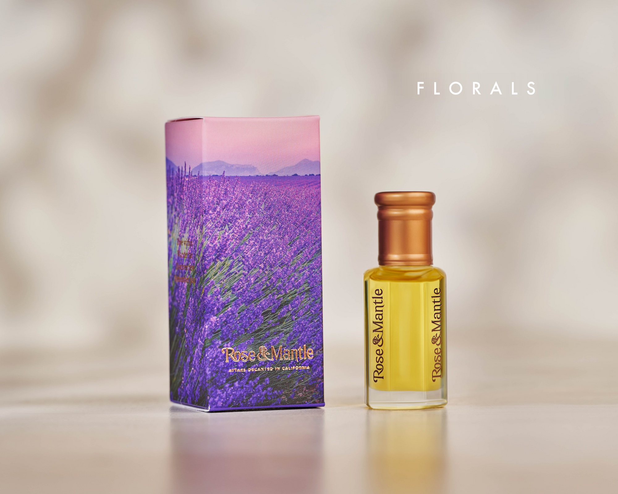
A custom logo for a fragrance brand, built around a rose-shaped ampersand.
- Role
- Logo design
- Direction
- Maece Seirafi
- Client
- Rose & Mantle
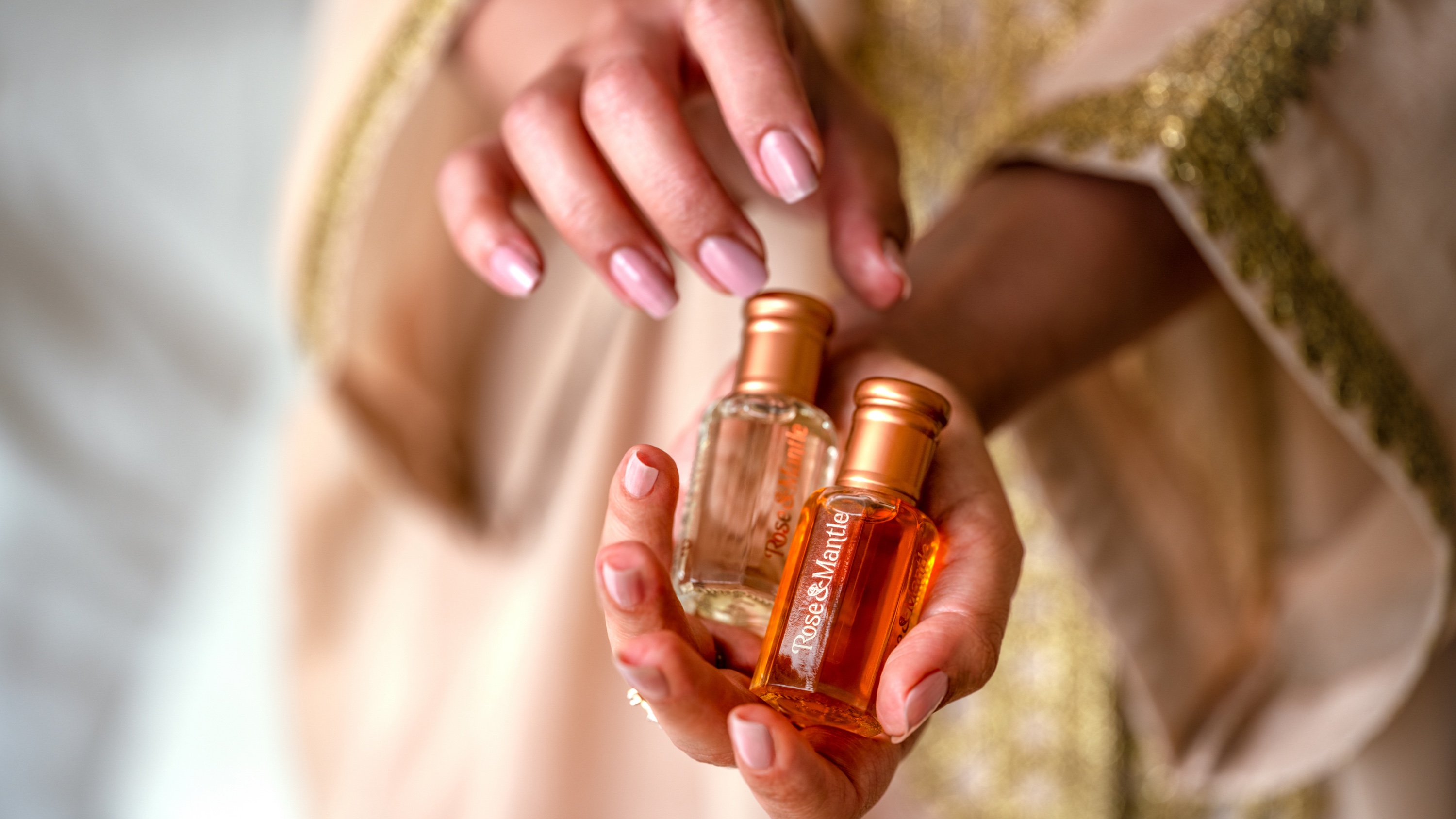
Elegant, but not precious.
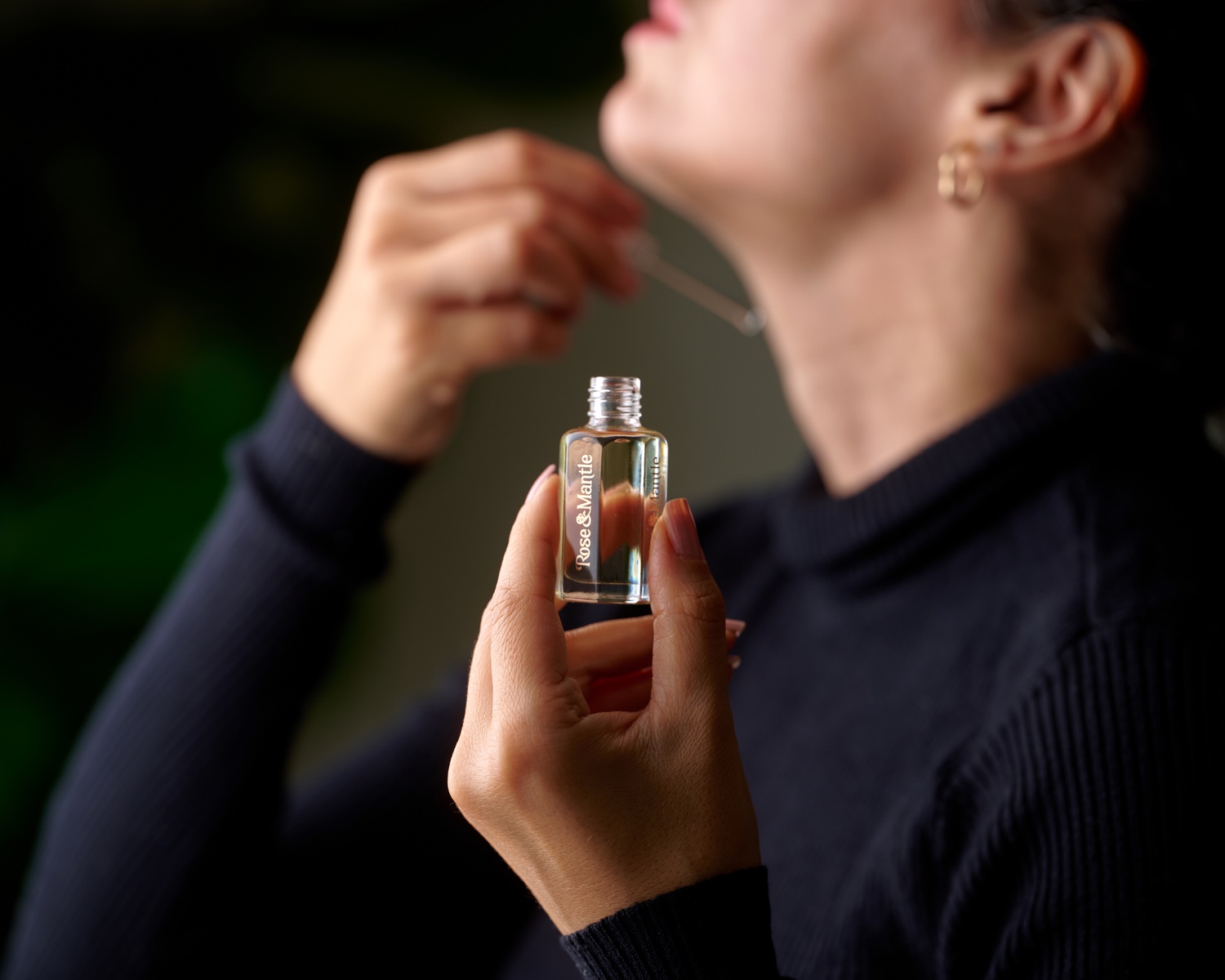
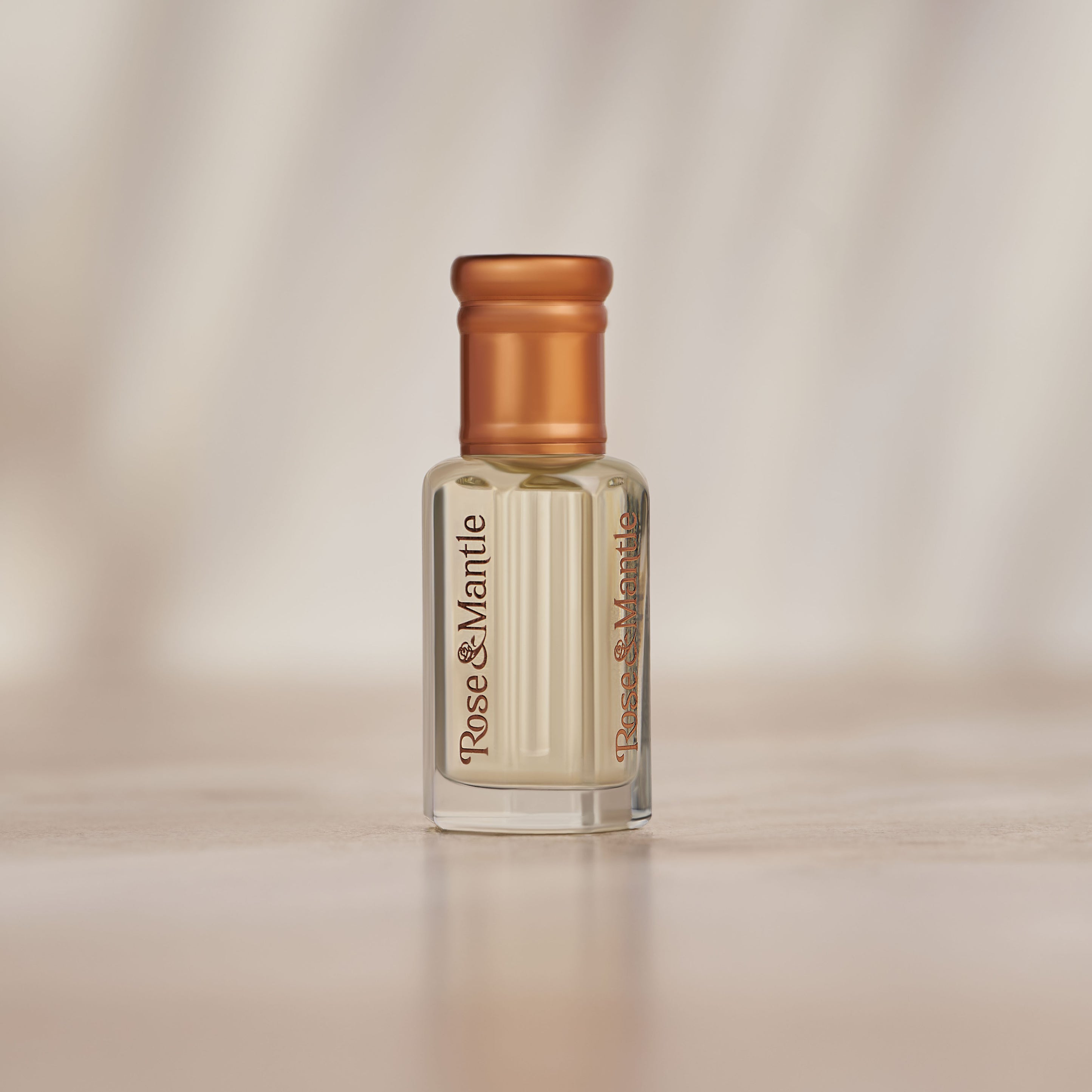
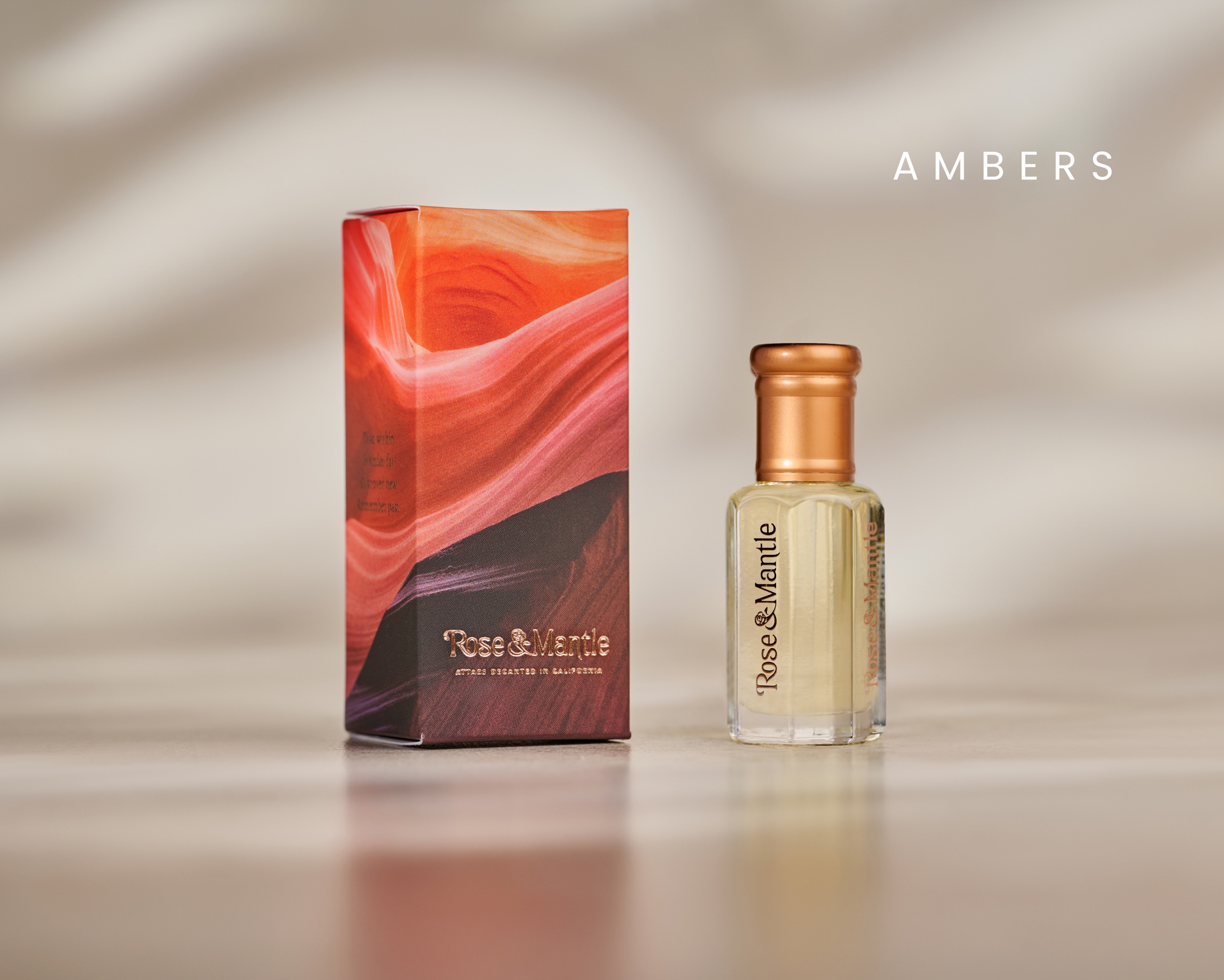
Rose & Mantle needed a logo that felt refined without feeling distant. Working under Maece Seirafi’s direction, I focused on a typographic mark with enough character for the brand and enough clarity for the packaging.
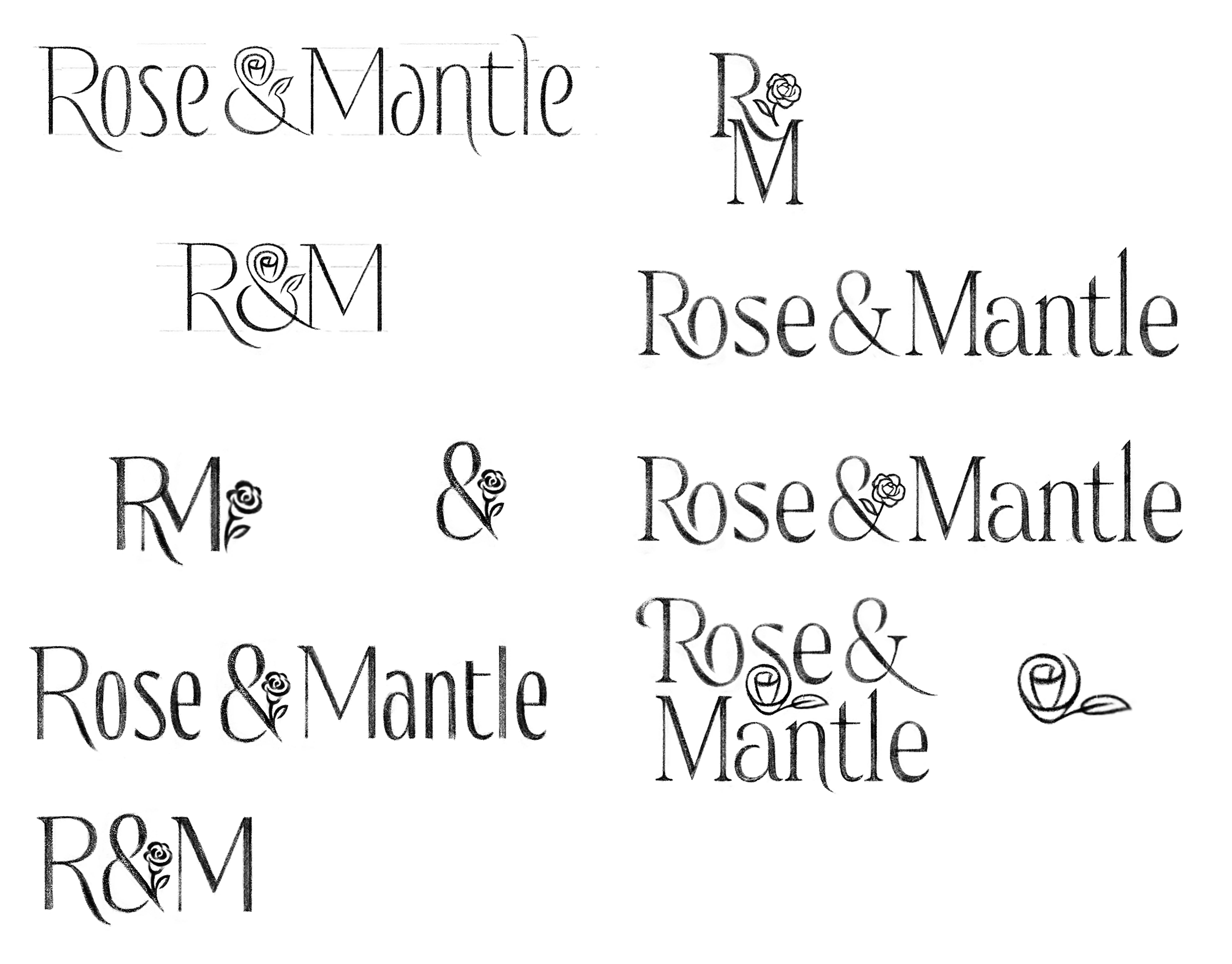
The ampersand was the idea.
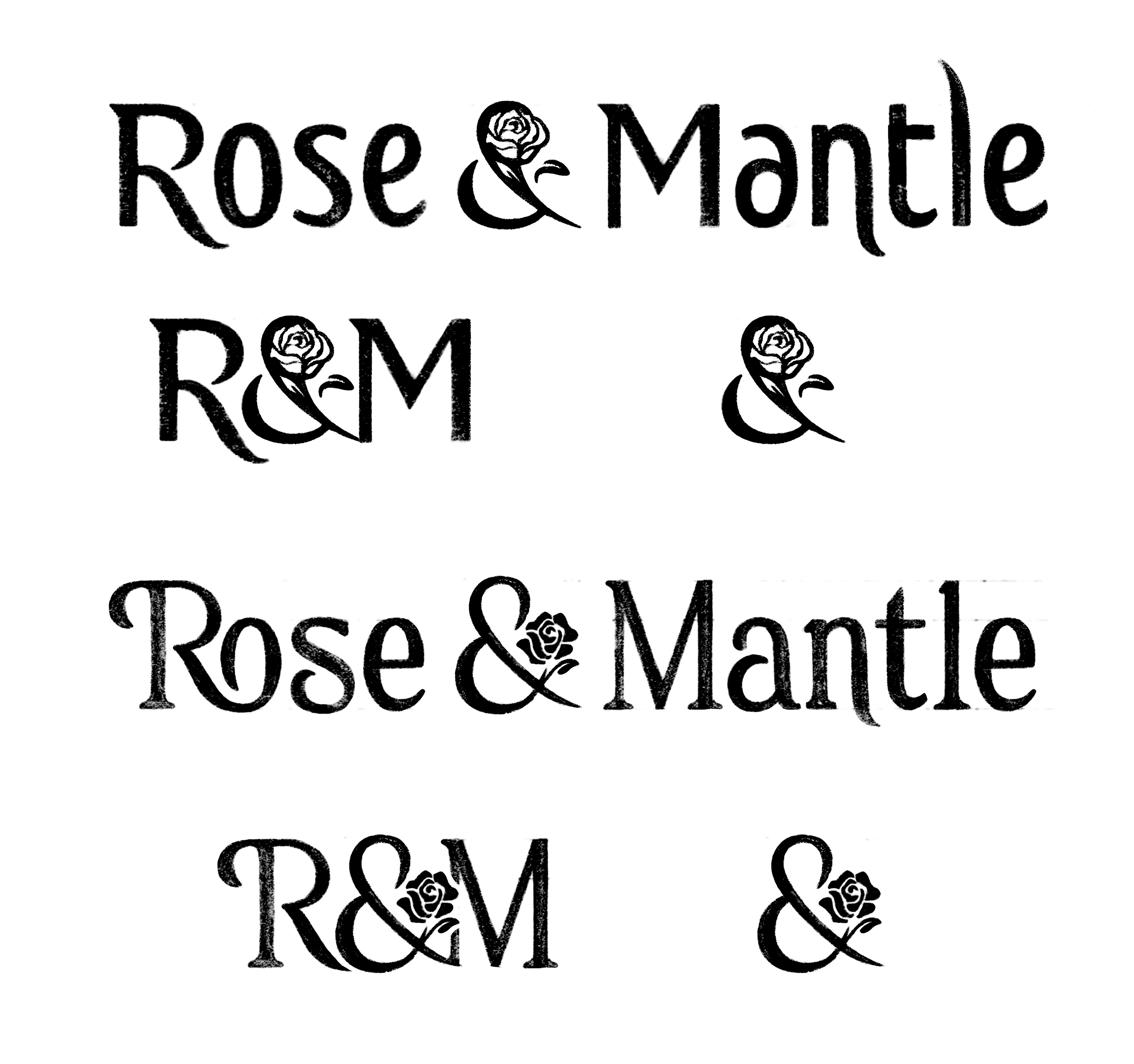
I explored wordmarks, monograms, and standalone symbols, but kept coming back to the ampersand. It already connected the two words, and it gave the rose a place to become part of the lettering instead of something added on.
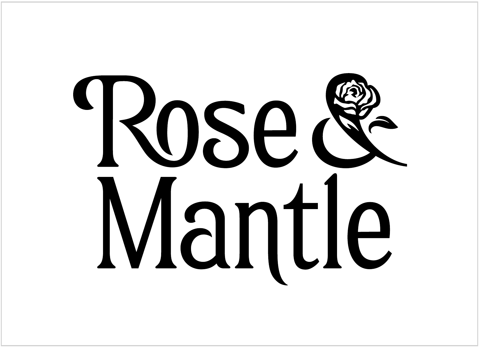
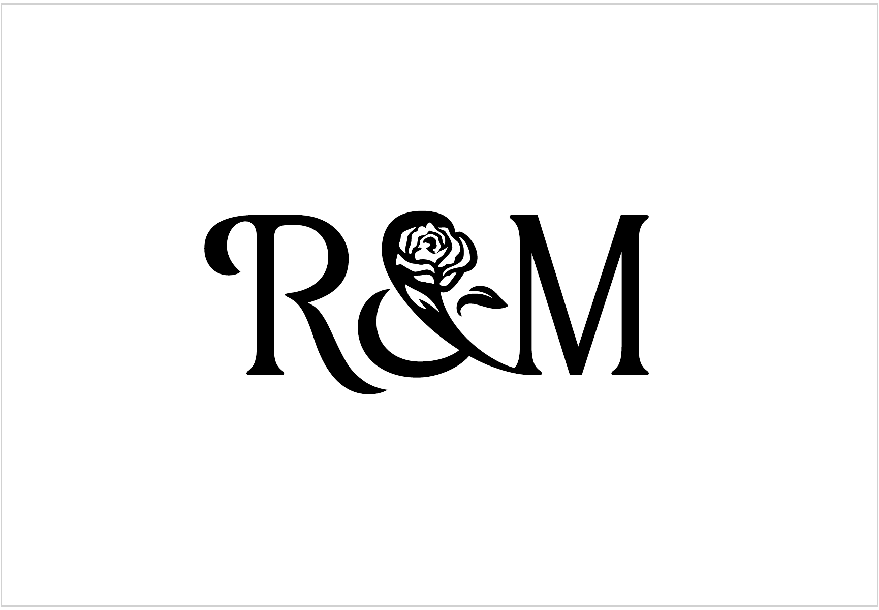
A rose built into the ampersand.
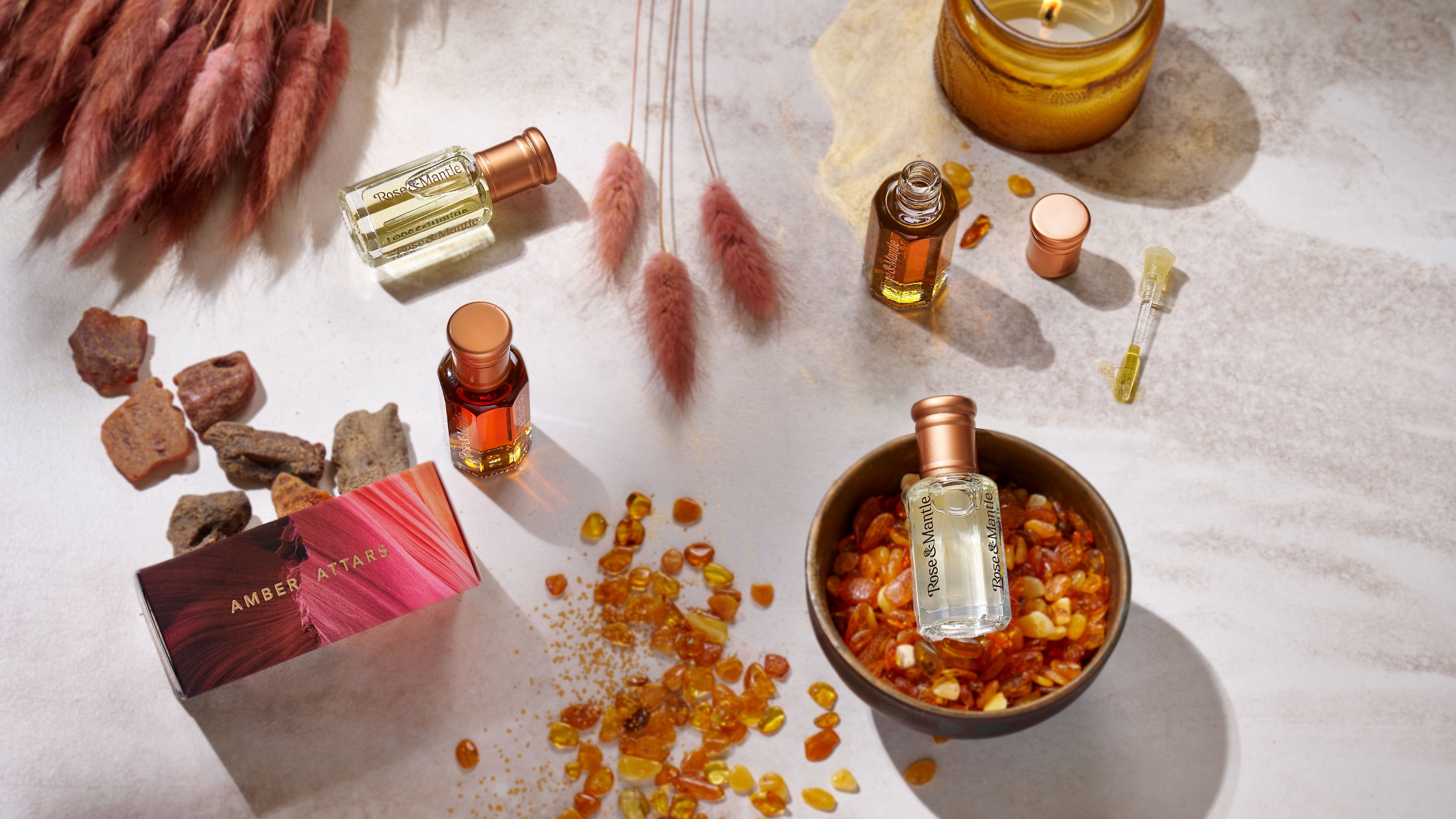
The final mark grows the rose directly from the joining character. The wordmark, stacked lockup, and monogram all carry the same idea, allowing the identity to move from bottles and boxes to smaller applications.