Close ×
02 / 06 — Food
Achaary
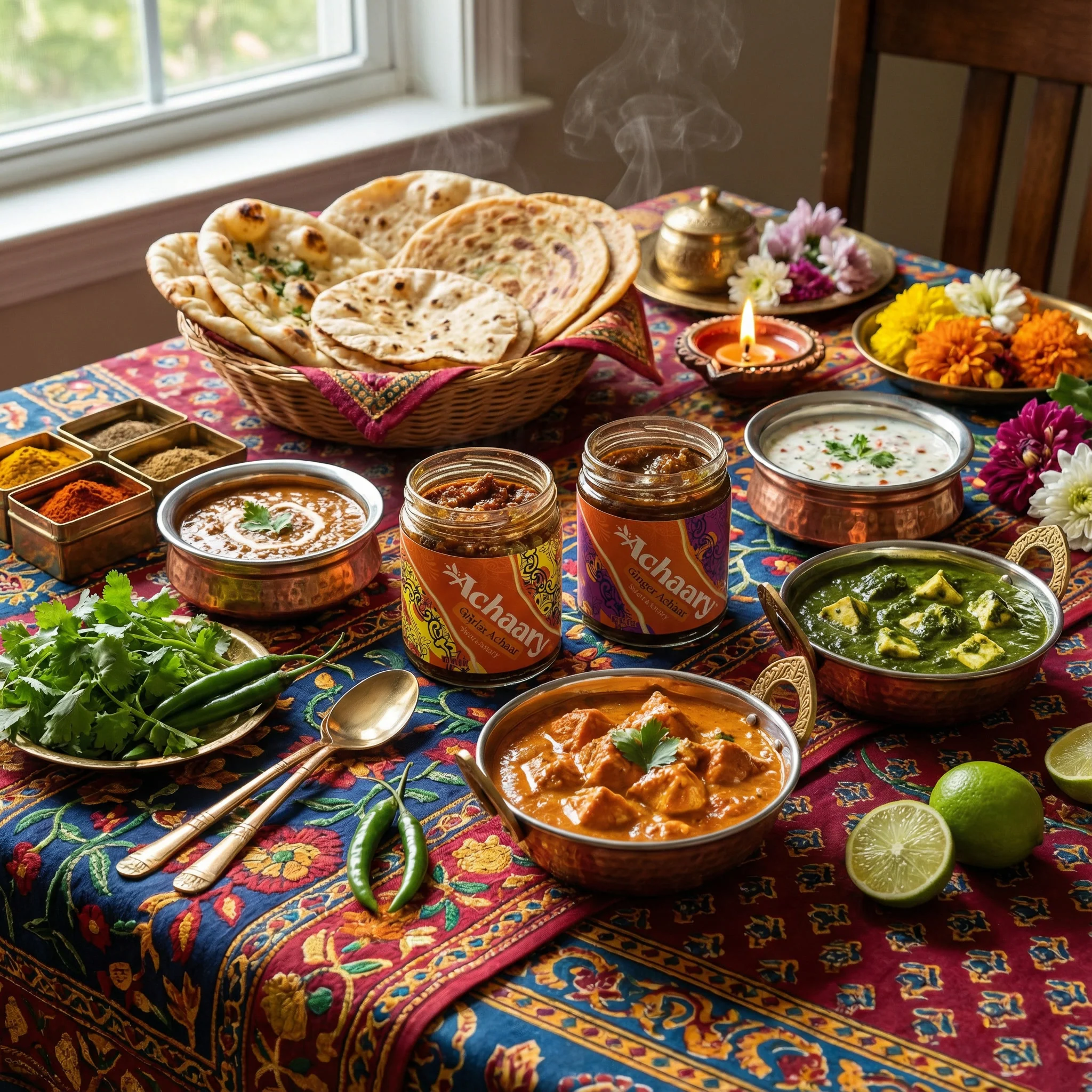
A bolder, more flexible logo for Achaary—made to work on jars, screens, and everything in between.
- Role
- Logo design only
- Direction
- Phillip Kauffman
- Deliverables
- Logotype + responsive marks
- Client
- Achaary
Keep the warmth. Make it work harder.
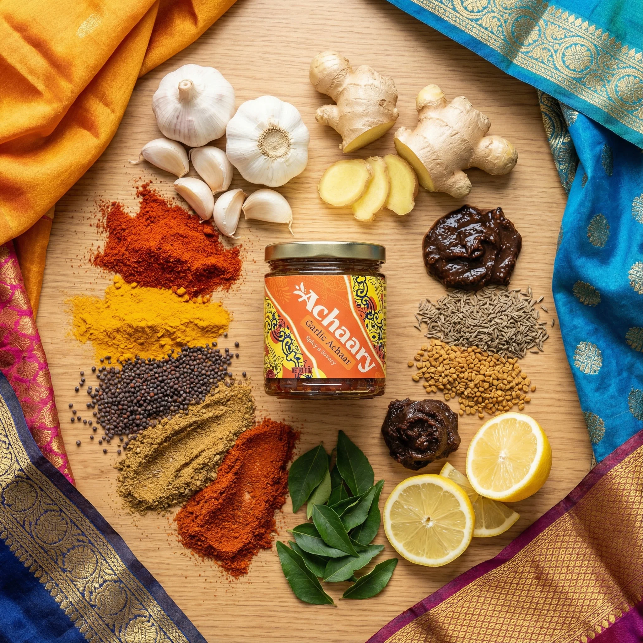
Achaary already had a warm, expressive identity. The redesign gave that personality a more distinctive shape, with a full wordmark for packaging and smaller marks for places where the whole name would not fit.
How much detail is enough?
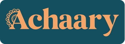
I explored botanical letterforms, standalone symbols, and more ornamental directions. The challenge was finding the point where the cultural and ingredient references felt present without making the logo harder to read.
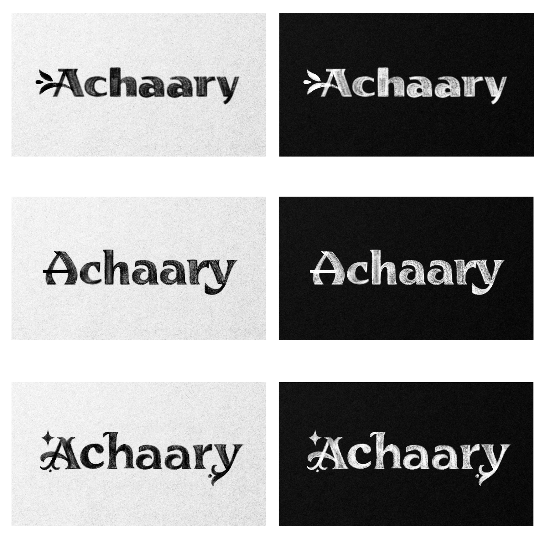
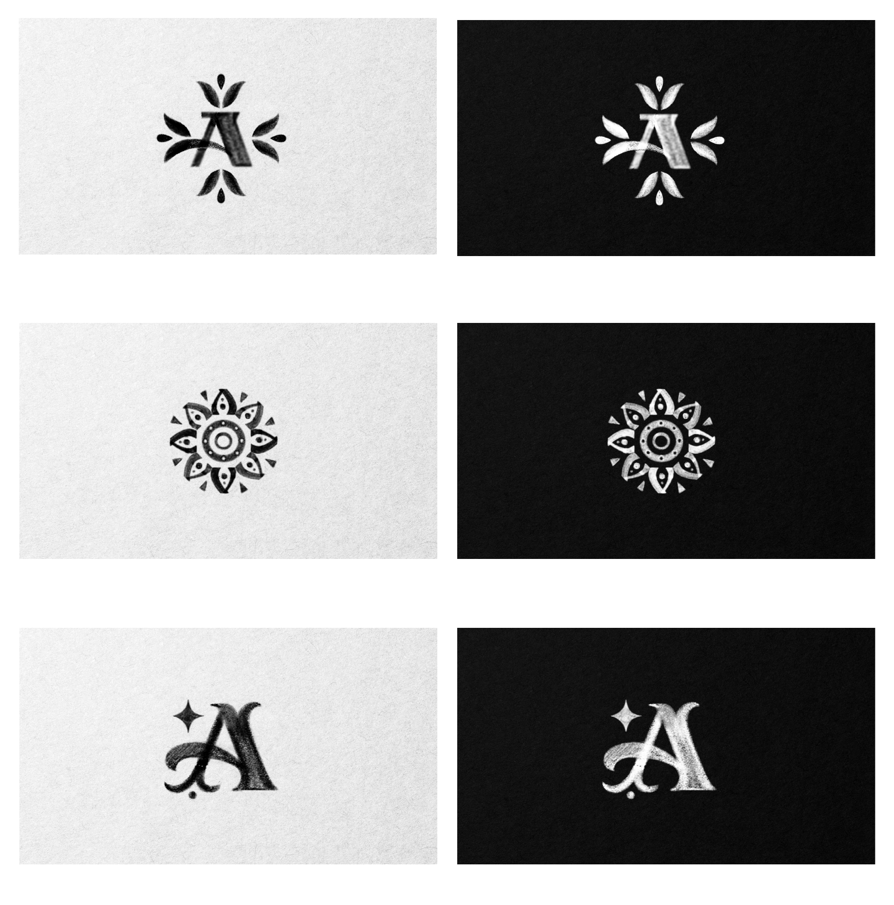
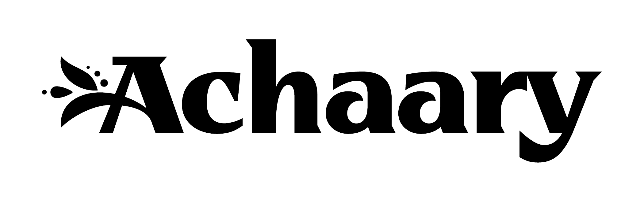
The detail lives in the A.
The final wordmark is heavier and easier to recognize, while leaves, droplets, and an arcing stroke bring the ingredient story into the first letter. The decoration is part of the name rather than something sitting beside it.
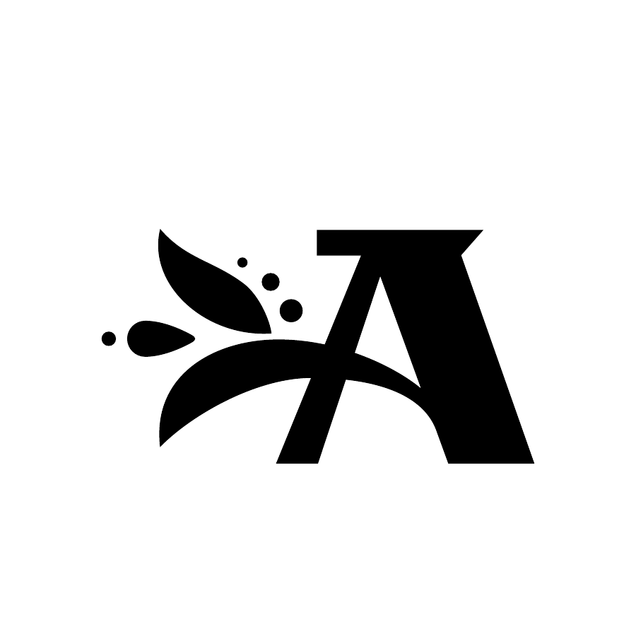
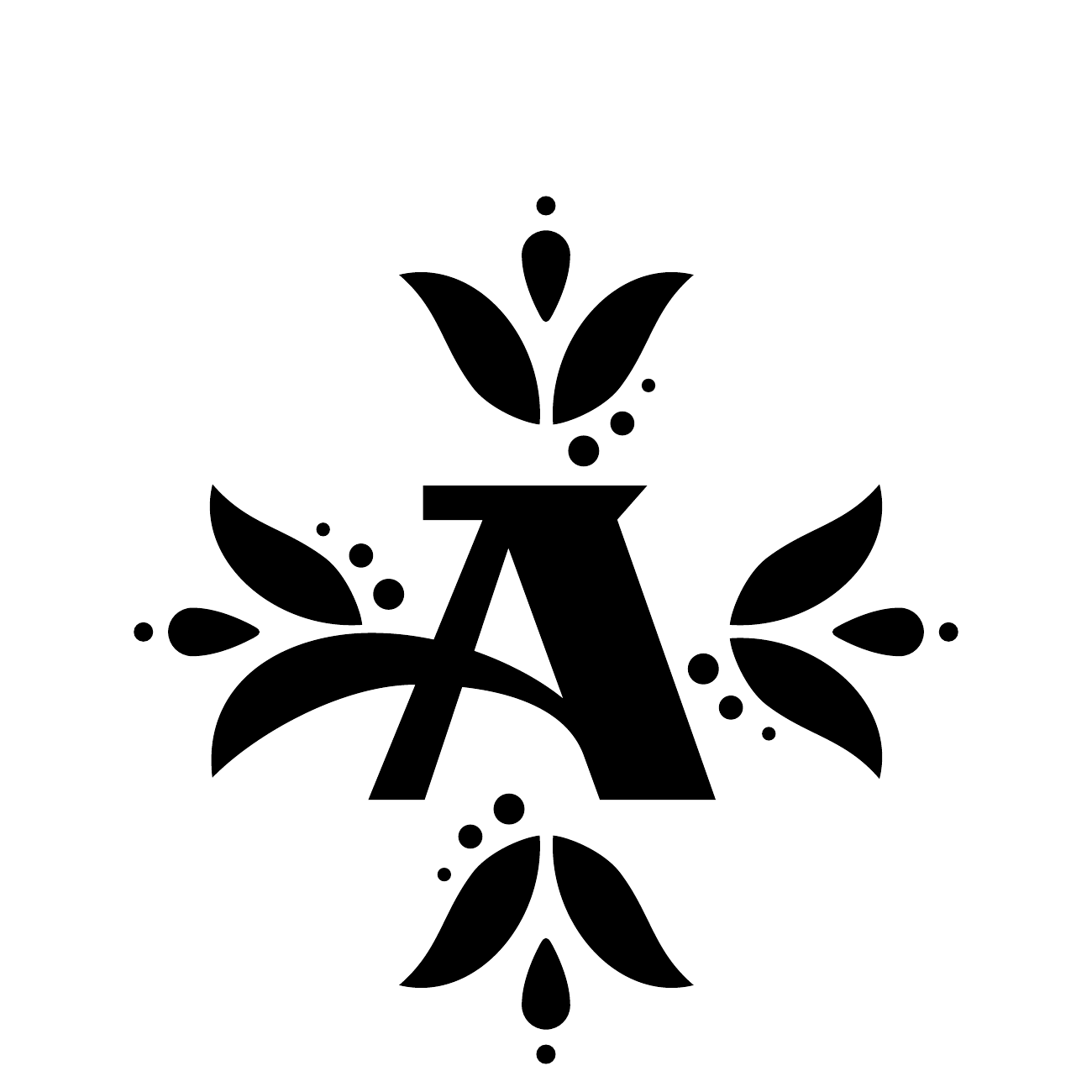
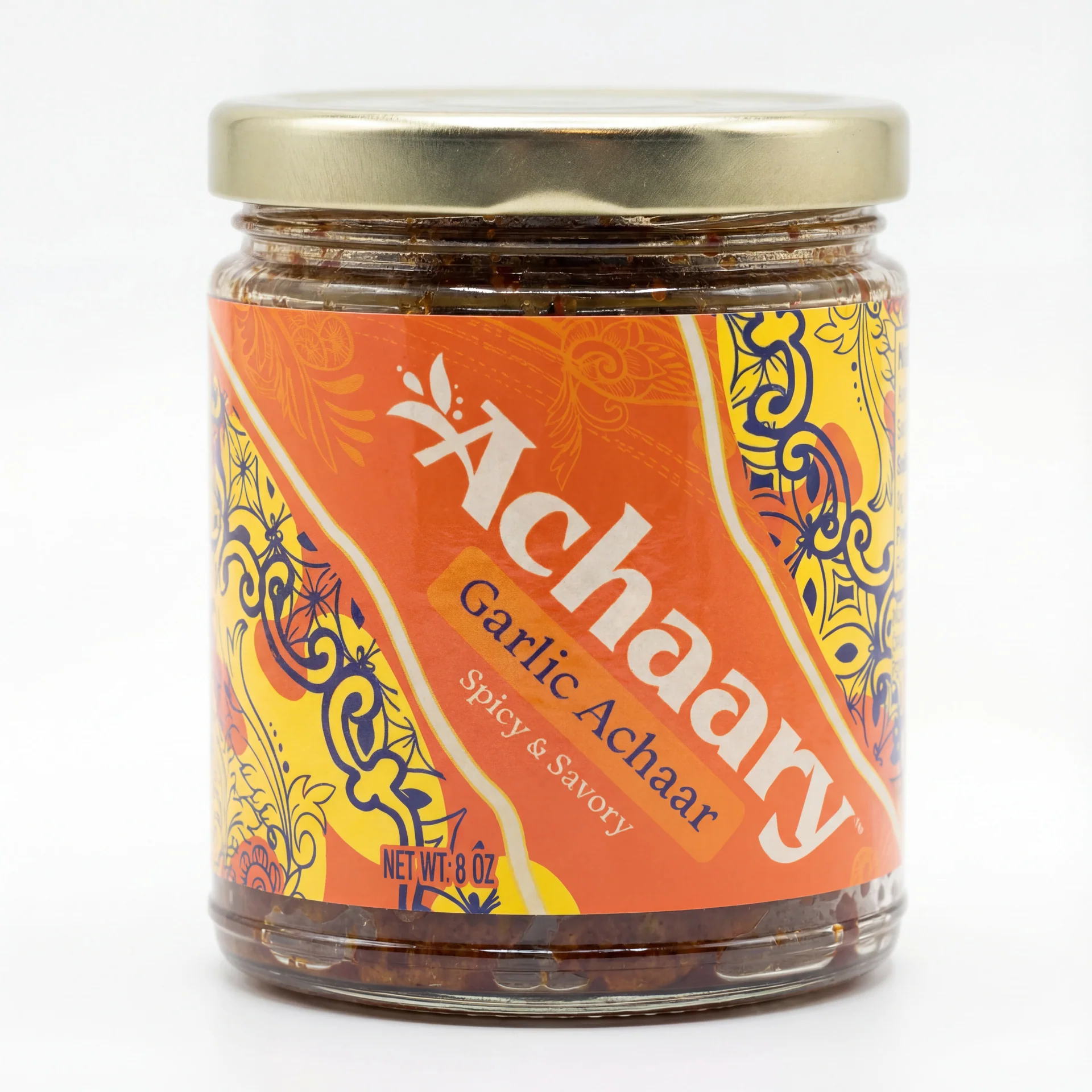
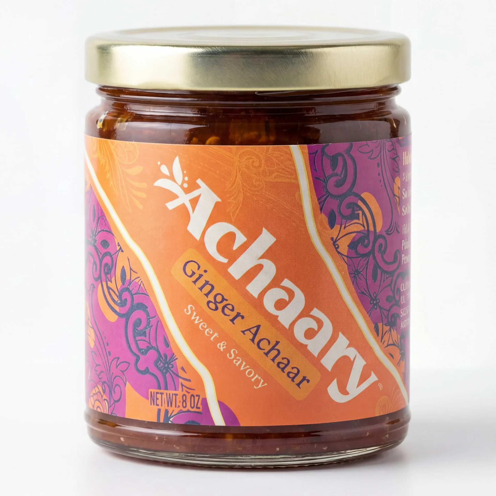
One family, three useful sizes.
The system moves from the full wordmark to two compact initials. Each version keeps the same leaf-and-arc detail, making the identity recognizable across Phillip Kauffman’s packaging at both large and small sizes.