 Close ×
06 / 06 — Publishing
Honey
Suckle
A custom masthead for a new independent magazine—drawn to stand out on a cover and stay flexible from issue to issue.
- Role
- Logo designer
- Deliverables
- Custom masthead + final artwork
- Client
- Honey Suckle Magazine

Giving the name more presence.
Honey Suckle already had a memorable name and an early logo with a lot of personality. My job was to turn that energy into a masthead that could carry a cover and still work with different photography, colors, and stories.
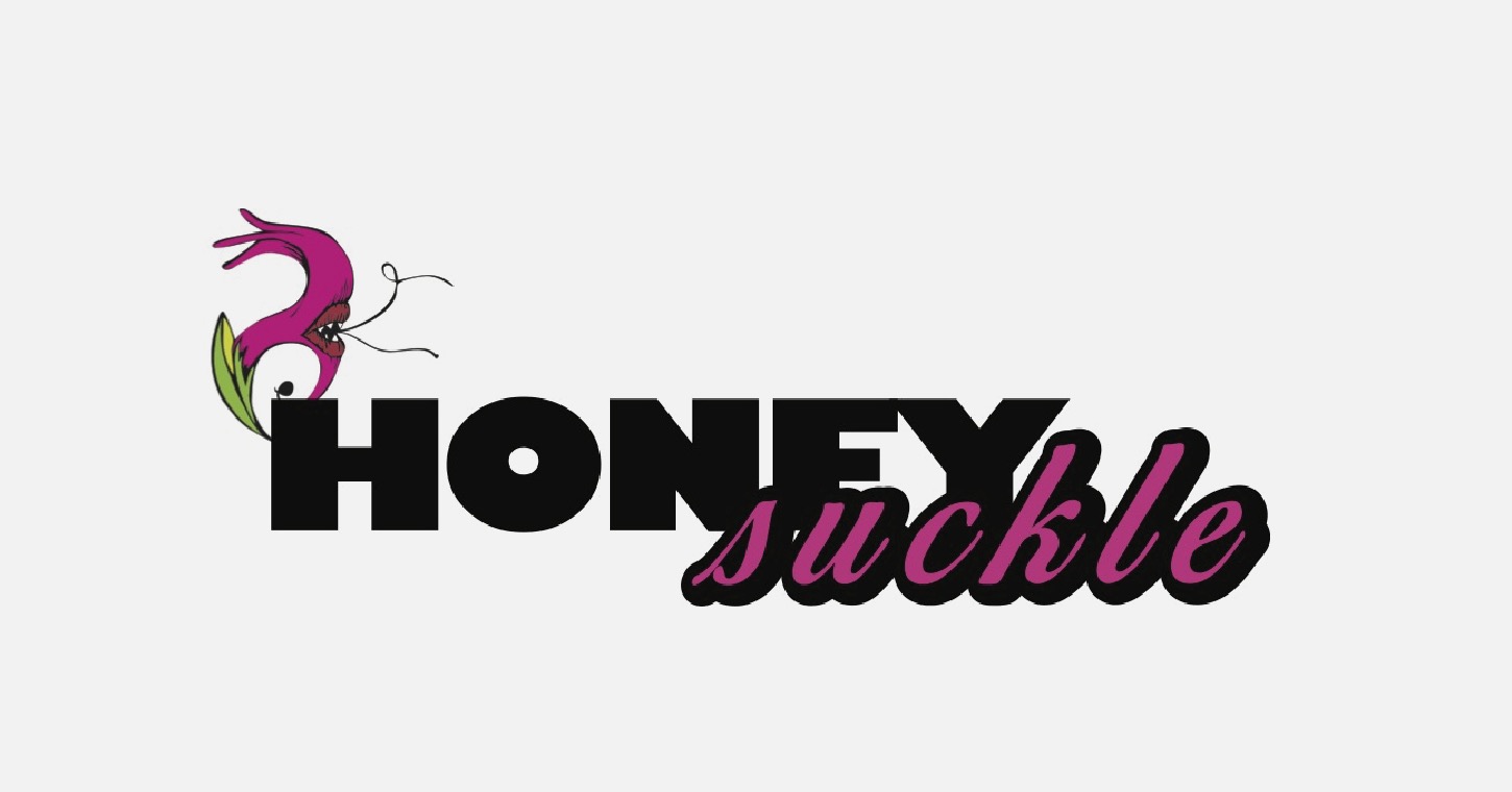
Bringing the name together.
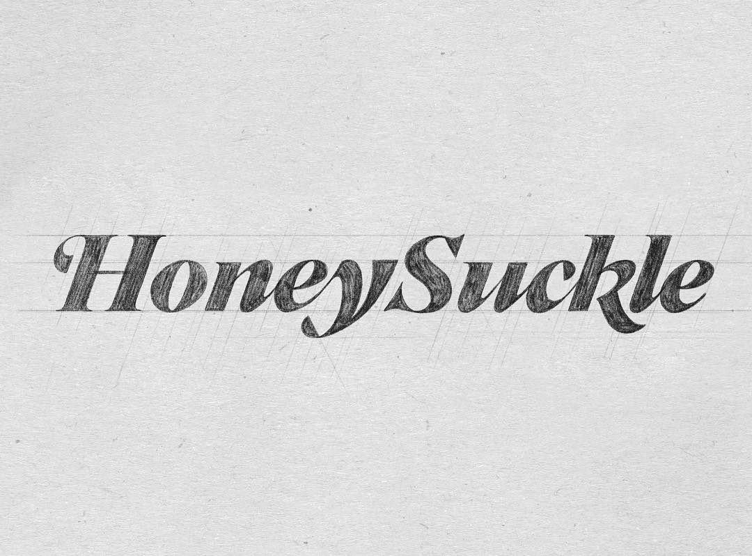
The sketch joined the two words into one continuous piece of lettering. I pushed the contrast, swashes, and connections until it felt expressive without becoming hard to read.
The Y has a little history in it.
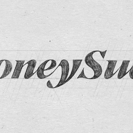
The original logo used a flower, and that idea stayed in the back of my mind while I was drawing. Instead of repeating it, I worked a petal-like turn into the tail of the Y—a quieter nod to where the magazine started.
Cleaning it up without cleaning it out.
I refined the curves, spacing, and connections in vector while keeping the movement of the drawing. The finished masthead stays clear at cover size and holds up when it gets smaller.

Made to change from issue to issue.
The masthead shifts in scale, color, and placement from cover to cover, but it still feels like the same publication. That flexibility was part of the point.
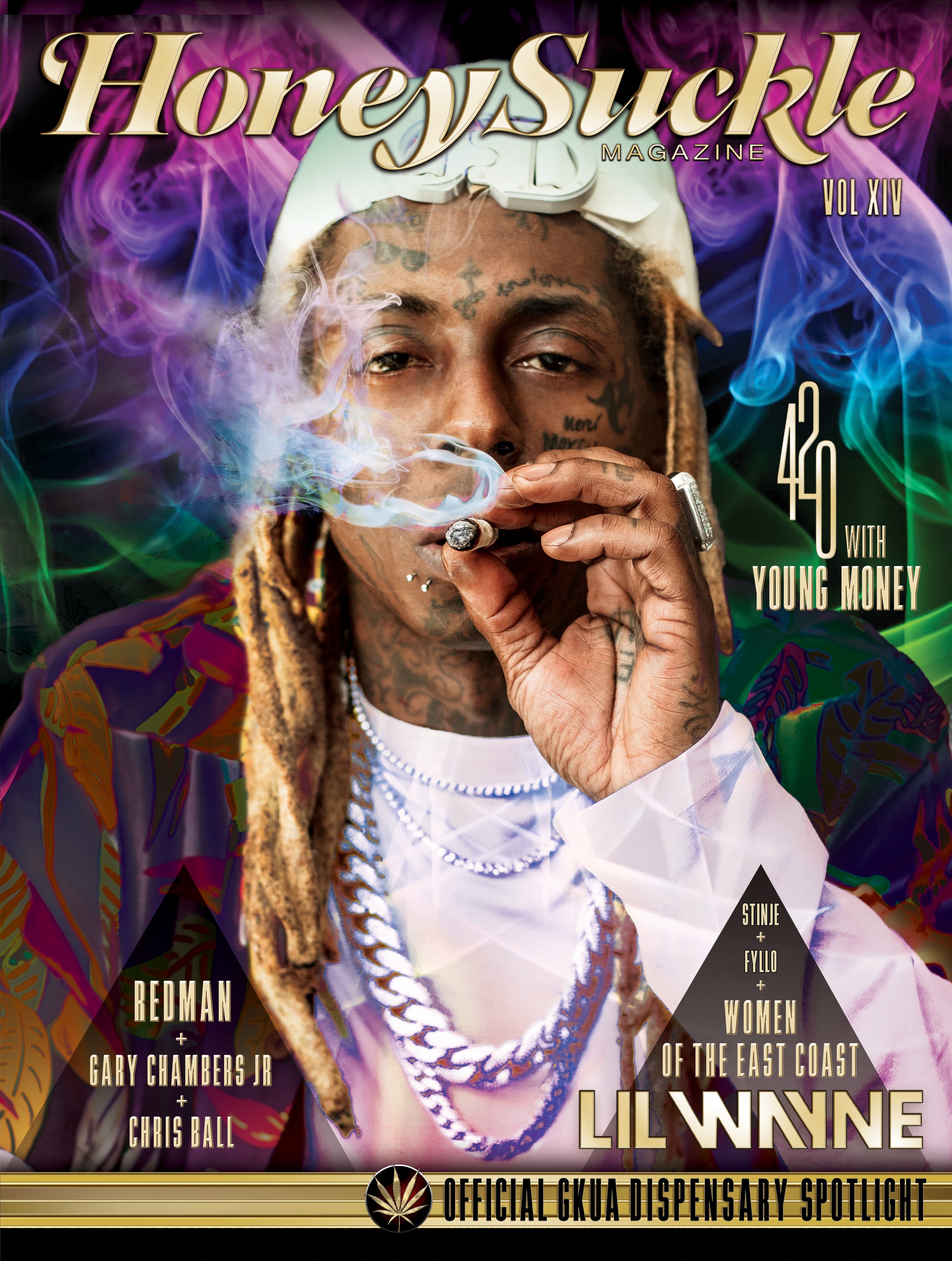



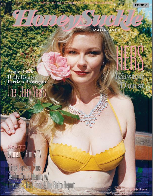
MASTHEAD DESIGN — DAVID SOTO / AKA.DOPE
EDITORIAL DESIGN, ART DIRECTION + COVER IMAGERY — HONEY SUCKLE MAGAZINE AND RESPECTIVE CREATIVE TEAMS
COVERS SHOWN SOLELY TO DOCUMENT THE MASTHEAD IN USE