Close ×
04 / 06 — Music
Blonde
Gentlemen
Custom lettering that gave the band a consistent name across very different releases.
- Role
- Logo design + custom lettering
- Deliverables
- Primary logo + reverse artwork
- Client
- Blonde Gentlemen


Easy to spot, wherever it shows up.
Blonde Gentlemen needed a logo that could work on a crowded bill, a streaming thumbnail, or the corner of an album cover. The goal was a compact piece of lettering with enough attitude to stay recognizable as the artwork changed.
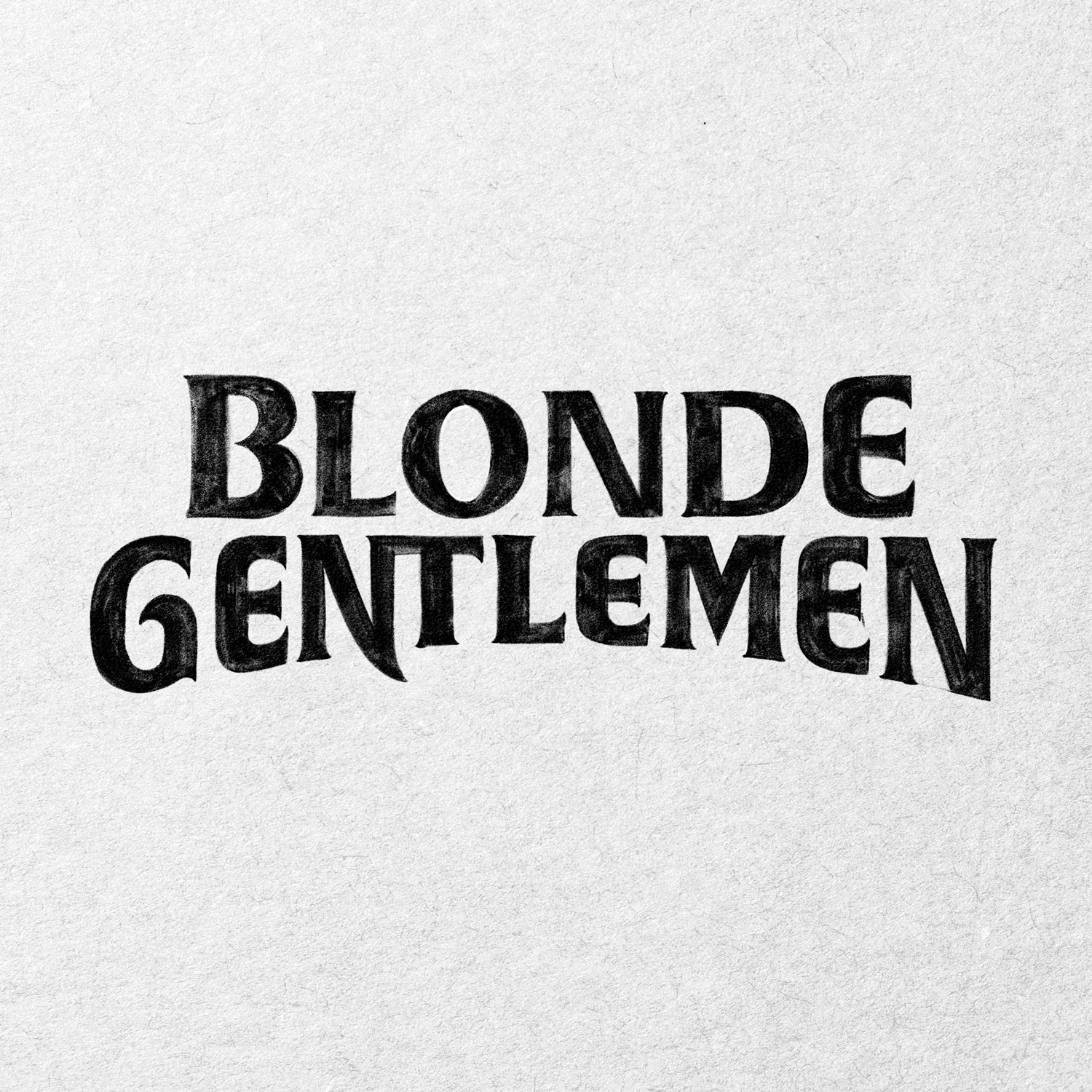
The serif version was too polite.
It had presence, but it felt too composed for the band. The selected direction added a forward lean, repeated diagonals, and longer strokes on the opening B and final E, pulling the two words into one shape.
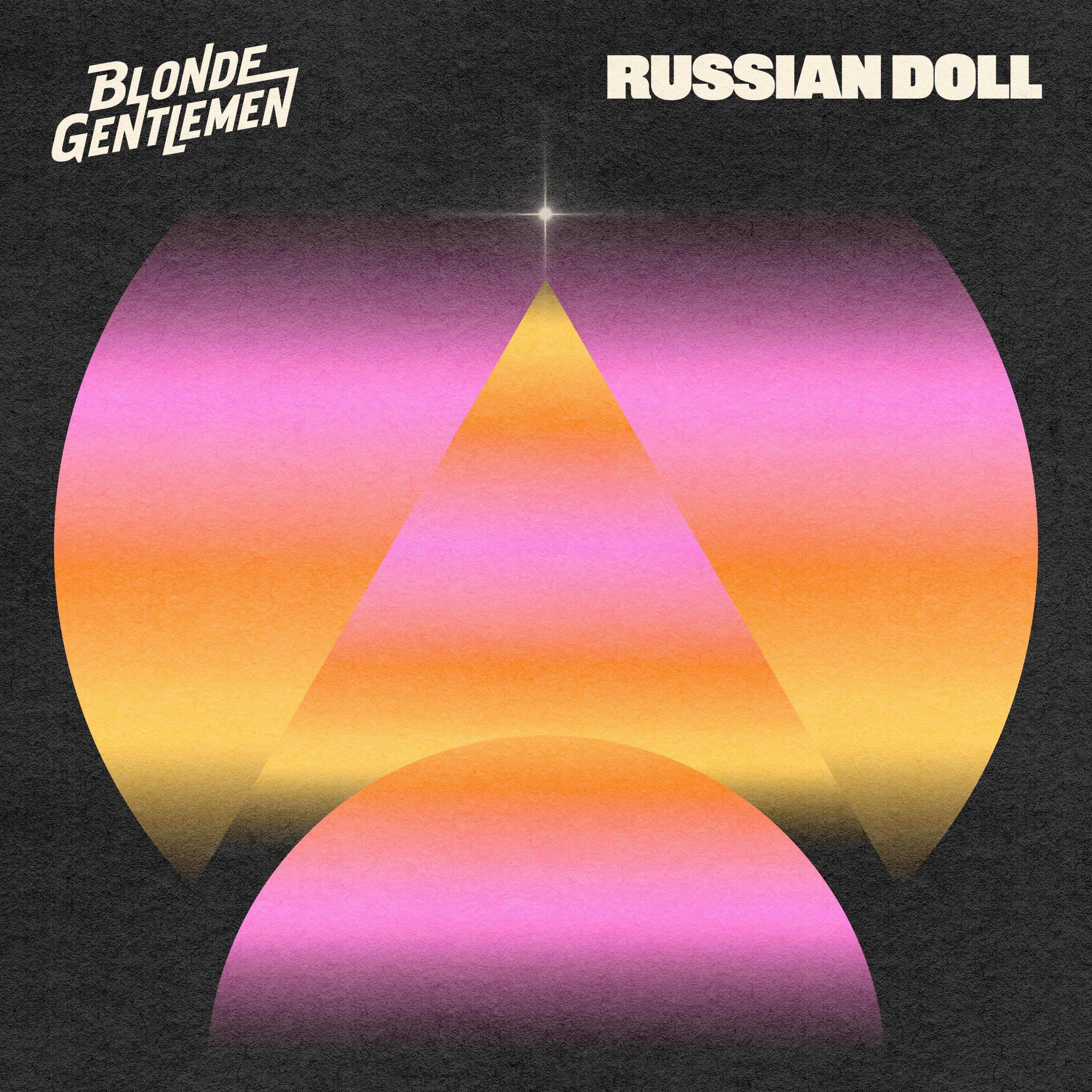
The records change. The logo stays.
Each release has its own artwork, but the lettering keeps them connected. The covers do not need to look alike for the band to remain recognizable.